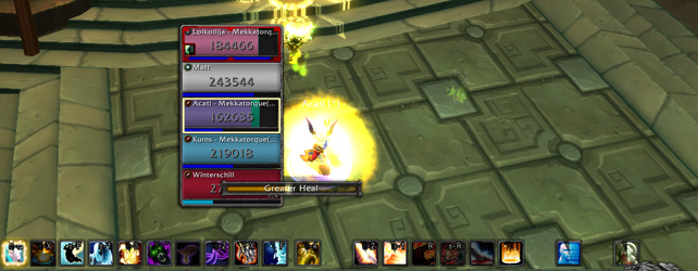
The default healing UI in WoW has come a long way since Vanilla. One of my favourite additions is the bar they have that shows the impact of your healing done. If you look up, you can see that little green strip that shows how much health is going to be restored with your heal.
Let’s look at Discipline shields for a moment. With Spirit Shell turning into the 1 minute ability turning your heals into absorbs, it becomes even more important to show how much your Flash Heal or Greater Heal is going to absorb for.
Here’s the problem.

You can clearly see that I have Power Word: Shield on myself. It’s going to wear off in a few seconds. Naturally, I have full health but have no way of knowing how strong my shield is without breaking open my combat log. Then I’d have to look at the absorb value and mentally calculate that as a percentage of my overall health which then causes my head to hurt.
Bro, I am healing. There is no time for me to do that. I just want to know how much firepower my shield can fend off.
Here’s the potential solution.

Same screenshot as above. The only difference is that I darkened the right side of my health bar slightly. I didn’t put a colour to it or anything. Originally, that image had a yellow stripe going down but then I realized Rogue health bars and class colours were yellow. A colour that’s bright and stands out would be ideal.
White? Nope, that’s for Priests.
Pink? Paladins.
What about an overlay or a shadow over top of the health frames instead? The right side of my Priest health frames is darker which would show how much my shields would take. The absorb bar would go from right to left. There’s addons right now where absorb amounts extend past the frame to the side. That’s a solution but I don’t consider that elegant.
The problem with that is in a raid setting, if you put out large absorb numbers, then the absorb bar would go past the frame and it might visually impede you from healing the person in the next group over in your UI.
Drop a big absorb on Jeanine in group 1 and watch as you can’t target Nathaniel in group 2 because that absorb bar is covering up part of their health frame.
I haven’t thought of what the UI would look like if my health wasn’t at full. That paladin that’s above me is at around 50% health. If I put a shield on them, should that green healing strip be used? Or a different color? Won’t be able to use a transparent or darkening solution because then it becomes black bar on a black background.
Lightening up the background might work though. A brighter background stripe could serve to highlight the absorb amount.
Whatever the case, I’m just hoping they consider looking at quality of life visuals for any kind of shields or mitigation.
I think the stock ui still has a long way to go. I still can’t track the duration of Beacon of Light without clicking on the target! It would go a long way if they would even incorporate some of the more basic features of vuhdo, or even Clique’s functionality.
I think your solution is a good one. In the case of the paladin above you, put the shadow on the health he/she still has remaining. The shadow represents how much of his/her (existing) health will not be lost to incoming damage. Don’t represent it as an incoming heal green bar as that doesn’t accurately represent what’s going on.
Another option might be to simply display the number of aborption points your shield has left, and have it dynamically decrease as the shield takes damage.
Either way, I don’t use the stock UI and haven’t since I was level 30 or so. 😉